
The evolution of the Starbucks logo reflects the transformation of the brand over the years. Since its beginning in 1971 with a two-tailed siren, each change has sought to connect with consumers and adapt to market trends.
This article explores the different stages of the logo’s design, analyzing how marketing and design have influenced Starbucks’ identity. Through each redesign, the brand has strengthened its global presence in coffee culture.
Origin and meaning of the siren in the Starbucks logo
The Starbucks logo, with its emblematic siren, is a representation rich in symbolism and meaning, deeply connecting with maritime tradition and the cultural narrative of coffee.
Influence of Herman Melville and Moby Dick on the original design
The interest in navigation and seafaring that arises from literature is strongly present in the original logo design. Herman Melville, through his work “Moby Dick,” establishes an evident link between the siren, the sea, and the pursuit of the sublime. In his work, Melville presents sirens as captivating creatures that draw men toward adventure and knowledge, reinforcing the idea of Starbucks as a place that invites people to explore different types of coffee and experiences in every cup. The decision to include a siren in the logo was not only aesthetic, but also a statement of intent: coffee and the culture surrounding it have an appeal that is both seductive and enigmatic.
Maritime tradition and its relationship with the first coffee merchants
Coffee has been connected to maritime trade since its beginnings. The first coffee importers depended on sea routes to carry this precious bean to different parts of the world. In this context, the siren in the Starbucks logo also symbolizes the connection between land and sea, underscoring the importance of the merchants who, through their travels, brought coffee to new markets. This link between the ocean and coffee quality reinforces the perception of Starbucks as a guardian of the coffee legacy, where each cup tells a story that begins in distant regions but ends in the heart of the local community.
Symbolic elements of the Starbucks siren
- The siren figure: It represents the visceral appeal that coffee has for consumers, evoking sensations of pleasure and comfort.
- The two tails: These tails are a symbol of duality, suggesting both the beauty of Starbucks’ offering and its authenticity, as they combine coffee’s legacy with a contemporary approach.
- Color and details: The siren designs, from their stylized features to their vibrant green color, are not only visually striking, but also reflect the freshness and quality that Starbucks wishes to convey.
The Starbucks siren has transformed its meaning over the years. From its original conception honoring the history of coffee and navigation, to its current role as an emblem of quality and community, the siren continues to be an element that resonates with coffee lovers around the world. Its ability to symbolize the search for unique experiences on every visit to a Starbucks coffee shop is what has established it as an icon inside and outside the coffee sector.
Founders and creation of the original logo
The beginnings of Starbucks are marked by the vision of its founders, who laid the foundations for the brand’s visual identity. This section explores the fundamental role of these pioneers in creating the logo that would later become a global symbol.
Role of Zev Siegl, Gordon Bowker, and Jerry Baldwin in the visual identity
Zev Siegl, Gordon Bowker, and Jerry Baldwin were the three friends who, in 1971, brought Starbucks to life in Seattle’s vibrant Pike Place Market. Their vision was clear: to offer high-quality coffee and related products. These founders not only focused on coffee, but also sought a way to communicate their passion through their brand. The decision to incorporate a siren into the original logo aligns perfectly with their focus on visual storytelling, evoking connection and tradition.
The role of Terry Heckler in the design and the brown color palette
The first logo was the work of designer Terry Heckler, who was tasked with capturing the essence of Starbucks in an image. His choice of a brown color palette was no accident. This color was intended to evoke a feeling of calm, naturalness, and connection to coffee’s origin, emphasizing its message of authenticity. The two-tailed siren was a central element of the design, symbolizing a deep bond with maritime tradition, while the maximalist style of the original logo incorporated a wealth of details that reflected the quality and complexity of the product.
The original Starbucks logo: details and maximalist style
The original logo consisted of a two-tailed siren, surrounded by the words ‘Starbucks Coffee, Tea and Spices’. This design was encircled by a finely detailed ring, which gave it a distinctive look. The siren, with its charming image, was intended to attract consumers, guiding them to discover the quality coffee the founders offered. The maximalist approach, with elaborate typography and intricate details, gave the brand a unique character in a sector where options were more limited.
This logo was not just a graphic representation, but a reflection of a time when coffee culture was beginning to gain momentum in the United States. Over time, this logo not only became a symbol of Starbucks, but also an internationally recognized icon that captured not only the essence of the brand, but also a cultural meeting point.
The evolution of the Starbucks logo: first transformations
The first transformations of the Starbucks logo mark a crucial period in the brand’s history. As the company began to grow, it was essential for its visual image to evolve to reflect its new direction and its focus on coffee.
The arrival of Howard Schultz and his influence on the brand
Howard Schultz joined Starbucks in 1982 and soon became a central figure for the company. His visionary approach to the coffee business was influenced by his experience in Italy, where he observed how cafés were spaces for socializing and community. This idea was fundamental in transforming Starbucks into a welcoming space, where coffee was served not only as a product, but as an experience. His vision drove the need to update the company’s visual identity, making significant changes to the logo that would resonate with the public.
Change to the green color palette and simplification in 1987
In 1987, Starbucks took a bold turn in its graphic design. The color palette changed from brown to a vibrant green, symbolizing freshness and growth. This choice not only affected the aesthetics of the logo, but also reflected an evolution in the brand’s philosophy. The decision to simplify the design was key, allowing the symbol to become the main focus.
Removal of “Tea and Spices” and focus on Starbucks Coffee
One of the most significant modifications to the logo was the removal of the words “Tea and Spices,” focusing exclusively on “Starbucks Coffee.” This change helped define the company’s value proposition and focus attention on its main product. By doing so, Starbucks positioned itself more clearly as a leader in the coffee industry.
Introduction of the ribbon and visual modernization
The visual modernization also included the introduction of a ribbon design that covered the siren’s tails. This detail not only added a contemporary touch to the logo, but also emphasized the brand’s connection with the ocean and its maritime tradition, without losing sight of the elegance and sophistication they wanted to project. This change was part of a strategy to connect emotionally with consumers who were looking for not just coffee, but a warm and welcoming atmosphere.
Implications of the first major evolution in branding
The evolution of the logo in 1987 had significant implications for Starbucks’ branding. By focusing on the siren and adopting a more modern design, the brand managed to rejuvenate its image and attract a broader audience. This approach not only allowed Starbucks to stand out in a competitive market, but also helped establish a deeper emotional connection with consumers. The logo went from being simply a representation of the company to becoming a symbol of quality and experience, paving the way for future expansions and establishing itself as an icon in coffee culture.
Global expansion and later redesigns
The evolution of the Starbucks logo has gone hand in hand with its expansion in the global market. As the brand became more established, it was necessary to make adjustments to its visual identity that reflected this growing presence.
The 1992 version: a cleaner logo focused on the siren
In 1992, Starbucks took a significant step toward modernizing its corporate image. The new version of the logo focused more clearly on the figure of the siren, removing the text that surrounded the image. This change not only simplified the design, but also emphasized its visual recognition.
The removal of the text and characteristics of the deeper green
By removing the text, the aim was to create an immediate impact and make the figure of the siren memorable. The choice of a deeper green gave the logo a sober and timeless character, suggesting a stronger connection to nature and sustainability, elements increasingly valued by consumers.
HOW THIS CHANGE REFLECTS BRAND IDENTITY AND CORPORATE CONFIDENCE
This new approach was not only aesthetic. The removal of the text represented Starbucks’ confidence in its brand identity. The siren, now at the center of attention, symbolized the company’s commitment to coffee quality and a unique consumer experience. This bold branding aimed to position Starbucks as a leader in the global coffee industry.
Adaptation to international markets and visual consistency
With global expansion, Starbucks faced the challenge of adapting to diverse markets. Visual consistency became a priority to maintain brand recognition across different cultures and regions.
The simplified logo allowed the brand to be easily recognizable, regardless of language or context. This standardized approach was crucial in a world where globalization and market diversification were on the rise.
The consistency of the design helped consumers, regardless of their origin, associate the values of community and quality linked to Starbucks, which were reflected in all its branches around the world. This visual element integrated perfectly into advertising campaigns and merchandising, fostering an emotional connection with customers.
- The aim was for the logo to maintain its essence as it expanded internationally.
- Variations of the image were used in local contexts, always respecting the identity of the siren.
As a result, the logo has become a cultural symbol in many countries, conveying messages of quality, comfort, and belonging in every café that opens. The evolution and adaptation of the logo have been key to Starbucks’ continued success worldwide.
Minimalism and contemporary design today
In the modern era, minimalism has taken center stage in graphic design, and Starbucks has not been an exception to this aesthetic trend that focuses on simplicity and the removal of superfluous elements.
The 2011 redesign: the siren as the only visual element
The redesign carried out in 2011 was a crucial step in Starbucks’ visual evolution. It was decided to focus attention exclusively on the siren, eliminating all the elements that had previously accompanied the logo. This approach sought to strengthen the brand’s identity and reaffirm its global recognition.
Removal of the circle and the text to simplify the image
The decision to dispense with both the circle surrounding the siren and the text that accompanied it resulted in a cleaner, more contemporary logo. This removal not only made the Starbucks symbol easier to view immediately, but also reflected renewed confidence in its brand. The minimization of the design helped ensure that, even at a reduced size, the siren remained a powerful and distinctive image.
The meaning behind minimalism in the Starbucks brand
Minimalism in Starbucks’ design encapsulates a philosophy that goes beyond aesthetics. This approach reflects the directive of simplification that many brands have adopted in the contemporary context. By eliminating the unnecessary, Starbucks not only highlights the importance of its main product, coffee, but also aligns its identity with the expectations of consumers seeking direct and authentic experiences.
Impact of the new logo on the consumer experience and on social media
The redesign has had a notable effect on how consumers perceive and engage with the brand. The simplicity of the new logo facilitates its instant recognition, both in physical stores and on digital platforms. This impact has translated into a strong visual presence on social media, where the logo image adapts easily and maintains a high level of engagement with users.
With minimalism, Starbucks has managed to connect with a modern audience that values clarity and authenticity. The use of the new design has enabled not only a better visual experience, but also a smoother integration into digital marketing campaigns and the brand’s visual communication.
The Starbucks brand beyond coffee: cultural and visual influence
The Starbucks brand has transcended its role as a simple coffee shop to become a cultural reference point worldwide. Its logo and the philosophy behind its products have influenced a lifestyle that goes beyond coffee itself.
The logo as a symbol of lifestyle and community
The Starbucks siren not only represents coffee quality, but has also become an emblem of a social and communal experience. The brand has cultivated a welcoming atmosphere that fosters connection between people, turning its stores into social spaces where consumers can enjoy coffee, work, or meet.
The logo symbolizes a community of Coffee Lovers who share a lifestyle that values quality, design, and sustainability. The image of the siren has become associated with positive experiences and memorable moments in a contemporary environment that invites relaxation.
Incorporation of the logo into campaigns and sustainable packaging
Starbucks has managed to integrate its logo into various campaigns that highlight its commitment to sustainability and social responsibility. The company uses more eco-friendly packaging, and the logo adapts to different promotional formats, demonstrating its versatility and relevance in today’s world.
This approach not only promotes sustainability, but also reinforces Starbucks’ identity as a conscious brand that cares about the environment. By using recyclable materials, the company also seeks to connect with a younger audience that values these initiatives.
Branding strategies and essential visual tools today
Starbucks’ branding is backed by innovative marketing strategies and striking visuals. The logo, now minimalist, facilitates recognition and adapts to different media, including social media and digital platforms. This adaptability has been key to maintaining its relevance in a competitive market.
Starbucks’ visual campaigns are carefully designed to resonate with its audience. They use visual elements that reflect the diversity of its products and the experience it offers. Its ability to tell a story through image and design has been fundamental in attracting Coffee Lovers and creating an emotional connection with them.
- Customer loyalty through an attractive rewards program.
- Integration of local events to strengthen community in stores.
- Use of social media to encourage consumer participation and dialogue.
These actions demonstrate how the Starbucks logo has come to be a symbol that represents not only coffee, but a cultural phenomenon that invites people to live the experience in a shared way.
Frequently asked questions about the evolution of the Starbucks logo
This section answers various common questions about the Starbucks logo and its evolution over time. Below are the answers to the most frequently asked questions we receive about this topic.
What does the Starbucks siren mean and why does it have two tails?
The siren in the Starbucks logo has a rich history and symbolizes the appeal of coffee. Originally, this icon was chosen for its connection to maritime tradition, symbolizing the seductive song that attracts sailors. The choice of a two-tailed siren is inspired by the concept that it has a mystical and enchanting appeal, representing the quality and pleasure that consumers can find in Starbucks coffee.
Why was the original brown color changed to green?
The transition from brown to green was a key step in the brand’s evolution. Brown evoked the idea of earth and naturalness, but with the brand’s growing ambition, a vibrant green was chosen that symbolizes freshness, growth, and modernity. This change not only modernized the logo, but also helped Starbucks position itself as a leader in the coffee market, highlighting its expertise and connection with consumers.
What was the reason for removing the text from the logo in 2011?
The decision to remove the text from the logo in 2011 was based on a strategy of simplification and on the confidence the brand had gained globally. By focusing solely on the image of the siren, Starbucks sought to position its logo as a universally recognized symbol. This minimalist approach not only aligned the brand with contemporary design trends, but also emphasized its identity and quality without relying on words.
How has Howard Schultz influenced the company’s visual identity?
After a trip to Italy, Howard Schultz brought a transformative vision to Starbucks. His influence helped turn the coffeehouse chain from a simple point of sale into a space for experience and socialization. His decision to modernize the logo and focus on the siren as a representative icon was key to establishing an emotional connection with consumers, elevating Starbucks’ perception within the coffee market.
What relationship does the logo have with the history of coffee and global coffee culture?
The Starbucks logo is not just a symbol of a brand, but represents the rich history of coffee and its culture. The choice of the siren reflects Starbucks’ connection to the ancient coffee merchants, who traveled by sea to carry the precious beans. The evolution of the logo has also been accompanied by a change in the perception of coffee globally, becoming a cultural phenomenon that promotes community and the enjoyment of coffee in all its forms.
Did you know that you can enjoy Starbucks coffee at home?
Starbucks offers a wide range of coffees to enjoy at home, available in specialty stores and supermarkets. From whole beans to capsules and ground coffee, the brand makes the same quality that characterizes its coffee shops accessible to consumers. Among its most popular varieties are Pike Place Roast, Espresso Roast, and special single-origin editions, which allow people to experience different flavor profiles depending on the coffee-growing region. In addition, Starbucks offers decaffeinated options and blends with aromatic notes ranging from chocolate and caramel to fruity nuances, allowing every coffee lover to recreate the Starbucks experience in the comfort of home.
Starbucks Nespresso Capsules

- STARBUCKS Discovery Variety Pack by NESPRESSO, 100 cápsulas
- Descubre nuestras variedades más vendidas,de diferentes tuestes (suave, medio e intenso), blends y orígenes
- Café 100% Arábica
- Cápsulas compatibles con máquina Nespresso
- Cápsulas hechas con al menos 80% de aluminio reciclado

- Cápsulas de café de STARBUCKS by NESPRESSO tostado con notas dulces
- Dulce e intenso, tueste italiano intenso sin ese toque ahumado
- Cápsulas de café compatibles con cafeteras NESPRESSO
- Disfruta de tú café STARBUCKS favorito sin salir de casa
- Café 100% arábica; una taza de café llena de sabor para disfrutar a lo largo de todo el día; comprometidos con el abastecimiento 100% ético de café en colaboración con Conservation International

- Cápsulas de café Starbucks by Nespresso con notas a caramelo aterciopelado
- Un Starbucks Blonde Roast, con un toque dulce, notas a caramelo aterciopelado y a vainilla; cápsulas hechas con 80% de aluminio reciclado
- Café 100% Arábica, para una taza simple y deliciosa en cualquier momento del día
- Prepáralo en casa como a ti te gusta con tu café Starbucks favorito
- Comprometidos con el abastecimiento ético de café al 100% en colaboración con Conservation International

- Cápsulas de café de STARBUCKS de NESPRESSO, equilibrado y con notas a frutos secos
- Cápsulas de café compatibles con máquinas NESPRESSO, cápsulas no compatibles para las máquinas Nespresso Vertuo
- Este café 100 % Colombia tiene un sabor intenso, un sabor espléndido y un regusto óptimo de frutos secos
- Disfruta de STARBUCKS en casa Tu café favorito sin salir de casa
- Comprometidos con el abastecimiento ético de café al 100% en colaboración con Conservation International

- Cápsulas de café de STARBUCKS de NESPRESSO, suave con notas de chocolate
- Cápsulas de café compatibles con máquinas NESPRESSO, cápsulas no compatibles para las máquinas Nespresso Vertuo
- Un café de tueste medio, equilibrado y redondo, con notas sutiles a cacao y frutos secos tostados con un balanceado y suave sabor en boca
- Disfruta de STARBUCKS en casa Tu café favorito sin salir de casa
- Comprometidos con el abastecimiento ético de café al 100% en colaboración con Conservation International
Starbucks Dolce Gusto Capsules

- Cápsulas de café Starbucks Exclusivo de Amazon, by NESCAFÉ Dolce Gusto; con una variedad de tuestes y mezclas de la colección Starbucks
- Paquete especial variado para descubrir la gama completa de Cafés Lattes de Starbucks
- Compatibles con las máquinas de café NESCAFÉ Dolce Gusto para una preparación perfecta
- Disfruta de tu café favorito de Starbucks sin salir de casa
- Comprometidos con el abastecimiento ético de café en colaboración con Conservación Internacional

- Cápsulas de café Starbucks Exclusivo de Amazon, by NESCAFÉ Dolce Gusto
- Con una gama de tuestes y mezclas de la colección Starbucks
- Paquete especial variado con Cafés Solos y con Leche de Starbucks para disfrutar en casa
- Cápsulas compatibles con todas las máquinas NESCAFÉ Dolce Gusto
- Prepara en casa tu café de Starbucks favorito

- Cápsulas de café de STARBUCKS de NESCAFE DOLCE GUSTO, suave y cremoso
- Inspirado por el Caffe Latte de STARBUCKS que tanto te gusta: intenso, aterciopelado y deliciosamente familiar
- Cápsulas de café compatibles con cafeteras NESCAFE DOLCE GUSTO
- Disfruta de STARBUCKS en casa Tu café favorito sin salir de casa
- Comprometidos con el abastecimiento ético de café al 100 % en colaboración con Conservation International

- Cápsulas de café Starbucks Exclusivo de Amazon, by NESCAFÉ Dolce Gusto; con una variedad de tuestes y mezclas de la colección Starbucks
- Paquete especial variado para explorar toda la gama de Cafés Solos de Starbucks desde la comodidad de tu hogar
- Cápsulas de café compatibles con las máquinas de café NESCAFÉ Dolce Gusto para mayor comodidad y facilidad
- Disfruta de tu café favorito de Starbucks sin salir de casa
- Comprometidos con el abastecimiento ético de café en colaboración con Conservación Internacional

- Cápsulas de café Starbucks Caffe Latte de Nescafe Dolce Gusto
- piezas, total 36 cápsulas, 36 porciones
- Disfruta de este café suave y cremoso en casa en una sola solución de cápsula
- Compromiso con una fuente de café 100% ética en asociación con Conservation International
Starbucks Whole Bean Coffee

- Café de grano entero de STARBUCKS con intensas notas a caramelo
- Intenso y con un toque de caramelo, este café es el que más empleamos para nuestro latte
- Disfruta de STARBUCKS en casa Tu café favorito sin salir de casa
- Los cafés de tostado intenso de STARBUCKS tienen más intensidad y carácter
- Comprometidos con el abastecimiento ético de café al 100% en colaboración con Conservation International
- Café de grano entero de STARBUCKS suave y con un toque de chocolate
- Café con cuerpo y suaves toques de cacao y frutos secos tostados que equilibran la suave sensación en boca
- Disfruta de STARBUCKS en casa Tu café favorito sin salir de casa
- Una taza de café intenso, agradable y equilibrado que podrás disfrutar a lo largo del día
- Los cafés de tostado medio de STARBUCKS son suaves y equilibrados

- Café de STARBUCKS de grano entero suave y envolvente
- Con un sabor suave y ligero, se trata de nuestro tostado de café más delicado
- Disfruta de STARBUCKS en casa Tu café favorito sin salir de casa
- Esta mezcla especial de granos de Latinoamérica se ha tostado cuidadosamente para obtener un resultado envolvente y vibrante
- Los cafés de tostado suave de STARBUCKS son más delicados y ligeros

- Starbucks café en grano, balanceado con notas a frutos secos; café balanceado y de cuerpo redondo con notas florales y a frutos secos
- Disfruta del café Starbucks en casa; tu café favorito sin salir de casa
- Este café de Colombia tiene un cuerpo redondo, sabor jugoso y un característico final con notas de frutos secos
- Los cafés de tueste medio de Starbucks son suaves y balanceados
- Comprometidos con el abastecimiento ético de café al 100% en colaboración con Conservation International

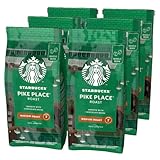
- STARBUCKS Pike Place Roast Café en Grano, suave y con un toque de chocolate
- Café con cuerpo y suaves toques de cacao y frutos secos tostados que equilibran la suave sensación en boca
- STARBUCKS Blonde Espresso Roast Café en Grano, suave y envolvente
- Con un sabor suave y ligero, se trata del tostado de café delicado; disfruta del café Starbucks en casa; tu café favorito sin salir de casa
- Comprometidos con el abastecimiento ético de café al 100% en colaboración con Conservation International
Starbucks Ground Coffee

- Café molido de STARBUCKS equilibrado y con notas a frutos secos
- Con un toque de flores y frutos secos, un buen equilibrio y una gran complejidad
- Disfruta de STARBUCKS en casa Tu café favorito sin salir de casa
- Este café 100 % Colombia tiene un sabor intenso, un sabor espléndido y un regusto único de frutos secos
- Los cafés de tostado medio de STARBUCKS son suaves y equilibrados
- Café de grano entero de STARBUCKS con intensas notas a caramelo
- Intenso y con un toque de caramelo, este café es el que más empleamos para nuestro latte
- Disfruta de STARBUCKS en casa Tu café favorito sin salir de casa
- Los cafés de tostado intenso de STARBUCKS tienen más intensidad y carácter
- Comprometidos con el abastecimiento ético de café al 100% en colaboración con Conservation International
At Coffee Sapiens, we want to thank you for joining us on this journey through the history and evolution of the Starbucks logo. We hope you enjoyed exploring how each change in its design reflects not only a visual transformation, but also a cultural and emotional narrative that connects with millions of Coffee Lovers around the world. Keep discovering, learning, and savoring every cup with curiosity and passion—because, in the end, the true spirit of coffee lies in sharing it. ☕💚

Soy Javier Romero, especialista en Marketing Digital, Coffee Lover y redactor de Coffee Sapiens.
Bienvenidos a Coffee Sapiens. Somos un medio digital independiente dedicado a la divulgación, análisis y cultura del café.